15/02- Week 2: playing with brushes
Hello. it's been a while not capturing up my blog since February cause I'm still sorting up thing. But its never too late to catch up. So here're some stuff that I've learned on week two's lesson.


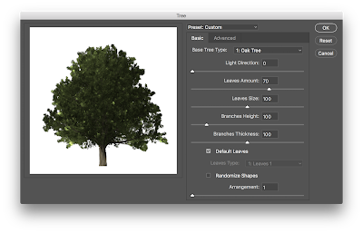


Okay, today we are basically discovering different brush setting in PHOTOSHOP and a general idea of designing a conceptual art using simple customized brushes.
Firstly, I choose the cherry blossom tree and rendered some features to enhance the features of those trees then stamp it from big to small in order to create a sense of depth in my work.
Additional to that, i intensified the colour of tree that is near to the foreground (bright hues to ligh hues).
Additional to that, i intensified the colour of tree that is near to the foreground (bright hues to ligh hues).
The reason why is because warm color normally pops while cool color sits back, while shadow goes the opposite around, the darker it is, the nearer the obj is to you.
After that duplicate, it again to create more trees at the back. still the same layer, I copy it and change to black and white to form shadows.
I wanted my environment to have that mysterious sense, so I chose purple-ish with some sunlight as my sky along with white sparkles to make it magical.
Here are the steps:


And this is my final work


Comments
Post a Comment